

React Native - Dynamic Flatlist
A way of calculating the numColumns property of a React Native Flatlist to make it dynamic and adaptable to changing screen sizes and orientations

Hi there! I am Fabian, a student from Germany. I recently decided to record my progress and, at the same time, share it with other people. Furthermore, I would be happy if you accompanied me on the way, and we acquired new knowledge together. 👨💻🚀 Hope to see you soon!
Introduction
Hi, I'm Fabian and this is my first blog post. I recently started learning about React Native. The other day, I was looking for a way to dynamically adjust the columns of a React Native Flatlist based on the screen size and orientation (horizontal or vertical) of the device. By the end of this article, you'll be able to create such a Flatlist:
Basics
First, let's start with a simple dataset for the data property of our Flatlist. For this example, let's take a data array that contains objects that each have just a key with an increasing number.
Now, we can already represent this data with a few lines of code. In addition to the data property of the Flatlist, we also need the renderItem prop, which in this case simply makes use of the keys of our array that we just created.
import { FlatList } from 'react-native';

const data = [
  { key: '1' }, { key: '2' }, { key: '3' }, { key: '4' }, { key: '5' },
  { key: '6' }, { key: '7' }, { key: '8' }, { key: '9' }
];

const App = () => {
    return (
      <FlatList
        data={data}
        renderItem={({item}) => { return item.key}}
      />
    );
}

export default App;
This list is still a long way from our desired result, but it already represents our desired data. If we now want to display this list in columns, we can use the numColumns property. For this, we define a constant with a value of 3 (we will change that in a moment).
At the same time, let's define a style that will center the objects, give them a background, and set them to a fixed height and width to form rectangles. In order for us to be able to see these, we also set a margin to 1. Furthermore, let's define a flex of 1 on a view enclosing the text to ensure automatic adjustment of the width of the rectangles.
const numColumns = 3;

const App = () => {
    return (
      <FlatList
        data={data}
        numColumns={numColumns}
        renderItem={({item}) => {
          return (
          <View style={styles.item}>
            <Text style={styles.itemText}>{item.key}</Text>
          </View>)
        }}
      />
    );
}


const styles = StyleSheet.create({
  item: {
    backgroundColor: '#A1A1A1',
    alignItems: 'center',
    justifyContent: 'center',
    flex: 1,
    margin: 1,
    height: 120,
    width: 90
  },
  itemText: {
    color: '#fff',
  },
});
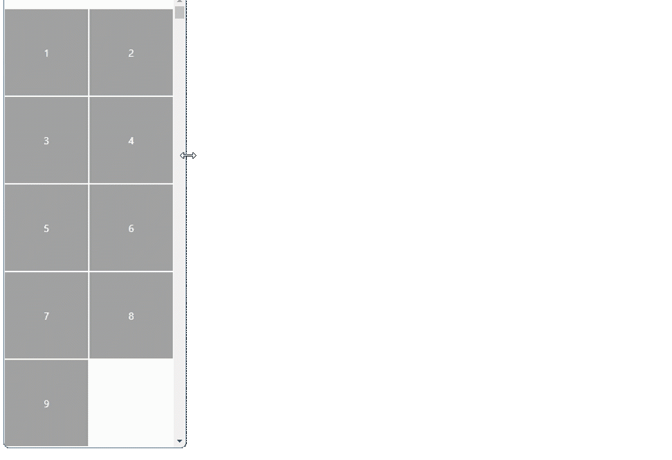
Empty items
Since we currently have nine elements, which we represent in three columns, we have three rows with three elements each. This makes everything look evenly distributed. However, if we now remove an element, we see that this is no longer the case.
Due to the added flex of 1, React Native adjusts the width of each object of each row to fill the entire width of the screen (except the margin). If this is your desired result, you can skip to the next header. If not, let's define a new function called formatData.
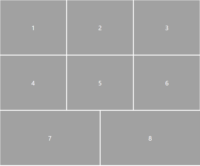
This function takes two parameters, data and numColumns. Given these parameters, we can calculate how many empty objects we need to add to our existing data array to fill the last row. If, as in this case, we have two items in the last row, we want to add an empty object to that row to reflect the column count of 3.
const formatData = (data, numColumns) => {
  const amountFullRows = Math.floor(data.length / numColumns);
  let amountItemsLastRow = data.length - amountFullRows * numColumns;

  while (amountItemsLastRow !== numColumns && amountItemsLastRow !== 0) {
    data.push({key: `empty-${amountItemsLastRow}`, empty: true});
    amountItemsLastRow++;
  }
  return data;
};
This method first calculates the number of full rows and subtracts that multiplied by the number of columns from our total number of objects in the data array to calculate the number of objects left over.
Practically speaking, it looks at how many elements have already been served and still have to be served. This number can be either 0 if all have already been resolved, or less than the number of columns. Therefore, in the last step, new objects are added to the data array until the number of elements in the last row corresponds to the required number of columns (amountItemsLastRow === numColumns).
It is important to note that the added objects must also receive a unique key. The boolean empty is used in the renderItem prop to display an empty object as such. To keep things simple, we're also relocating the renderItem as a standalone method.
const renderItem = ({ item, index }) => {
    if (item.empty) {
      return <View style={[styles.item, styles.itemTransparent]} />;
    }
    return (
      <View style={styles.item}>
        <Text style={styles.itemText}>{item.key}</Text>
      </View>
    );
  };

const App = () => {
    return (
      <FlatList
        ...
        renderItem={renderItem}
      />
    );
}
As you may have noticed, there is now an additional style that is applied in the renderItem function if the object has the boolean empty, and it is true to make the background transparent.
Dynamic numColumns
Now let's get to the part we've been waiting for: dynamically adjusting the number of columns. In order to achieve this, we need to keep in mind what can happen and how we want our app to react. The user can rotate their phone so that the view can switch from vertical to horizontal mode or vice versa. Another example is Samsung's foldables, which can change their view by opening or closing the device.
Since this also changes the width and height of the window each time, we track the width using the useWindowsDimesions hook for this application. This allows the width to be destructured at the beginning of our component.
const {width} = useWindowDimensions();
By using the React useState we can now replace the numColumns constant accordingly and set the initial state to a function that we will implement later in order to be able to calculate the number of columns depending on the width that has just been destructured.
const [numColumns, setNumColumns] = useState(calcNumColumns(width));
The useEffect hook helps us detect a change in the width variable through useWindowDimensions, and then replace the numColumns with a recalculation using the updated width.
useEffect(() => {
    setNumColumns(calcNumColumns(width));
  }, [width]);
The only thing left now is to write our function for calculating the columns. First, we have to think about which calculation we want to use to determine the number. We calculate the not rounded count cols by dividing the width passed in by the width of one of our objects .
const calcNumColumns = (width) => {
  const cols = width / styles.item.width;
};
We also specify a constant colsFloor, which either takes on the value of a fixed minimum number of numColumns, or, if our just calculated cols is larger when rounded down, should equal this value.
const minCols = 2;

const calcNumColumns = (width) => {
  const cols = width / styles.item.width;
  const colsFloor = Math.floor(cols) > minCols ? Math.floor(cols) : minCols;
};
From this, we now have to subtract the total margin to calculate how many columns fit in one row. If we temporarily increase the margin to 15, for example, we see that the spacing at the edges of the screen is half the spacing between objects.

This is because the margin applies to each object and is therefore duplicated between the objects themselves. We take this into account in our calculation by multiplying the rounded number of columns by the generated distance twice. This allows us to derive the total margin and subtract that from cols to know if our colsFloor fit into cols along with that margin.
const minCols = 2;

const calcNumColumns = (width) => {
  const cols = width / styles.item.width;
  const colsFloor = Math.floor(cols) > minCols ? Math.floor(cols) : minCols;
  const colsMinusMargin = cols - 2 * colsFloor * styles.item.margin;
  if (colsMinusMargin < colsFloor && colsFloor > minCols) return colsFloor - 1;
  else return colsFloor;
};
If the resulting difference (colsMinusMargin) is smaller than the rounded one (colsFloor), this means that including our defined distance between the objects a maximum of colsFloor - 1 elements will fit in one row, otherwise colsFloor. The rest of the if ensures that we don't display fewer than our defined minCols columns.
Final fix
Now if we run this code like this and rotate our screen, we get an error message saying:
Changing numColumns on the fly is not supported. Change the key prop on FlatList when changing the number of columns to force a fresh render of the component.
This can be fixed by setting the Flatlist's key prop to numColumns.
Everything put together
Here you can finally try out for yourself how the flat list changes as a result of your own adjustments. If you want to rotate the screen or change the screen size, just open the app on your own mobile device or the Snack webplayer. After opening the link you can use the web player by clicking on the small icon to the right of the blue web button.
Conclusion
With that we have come to the end. Thanks for reading my first blog article. If you have any suggestions for improvement or questions, please leave a comment. Have fun with the Flatlist and see you soon!